[Next] [Previous] [Top] [Contents] [Index]
VxVM User's Guide
Description of the Visual Administrator
Chapter 2
Introduction
This chapter describes the graphical user interface for the Volume Manager, called the Visual Administrator (vxva).
The following topics are discussed in this chapter:
The quick reference sections at the end of this chapter provide information on menus and forms associated with Visual Administrator windows.
Note: An understanding of Volume Manager objects will help you use the Visual Administrator. Refer to Chapter 1, "Description of the Volume Manager," for more information.
Purpose of The Visual Administrator
The Visual Administrator's primary function is to provide a graphical user interface to the Volume Manager. In addition, the Visual Administrator acts as an interface to several common file system operations; some of these file system operations are supported for the VERITAS File System (VxFS®) only.
The Visual Administrator interface is relatively intuitive and easy to use. Windows, menus, forms, and icons are provided to help you. The Visual Administrator is one of several interfaces to the Volume Manager. Volume Manager objects created by one interface are fully inter-operable and compatible with those created by the other interfaces.
Visual Administrator Icons
The Visual Administrator represents the various Volume Manager objects through icons. When a change is made to existing Volume Manager objects using the Visual Administrator (or another Volume Manager interface), every open Visual Administrator session on the same system automatically adjusts its icons to reflect the change.
Volumes are usually composed of plexes (mirrors), which are composed of subdisks. Volume icons therefore typically contain associated plex icons which, in turn, contain associated subdisk icons. While both volume and plex icons can appear alone and with no associated components, they are not useful in this form.
The Visual Administrator uses the following icons to represent Volume Manager objects.
Physical Disk Icon
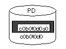
Physical disks appear as cylindrical icons labeled PD. These icons contain rectangular partition icons. Physical disk icons represent physical disks known to the Visual Administrator. Physical disk icons appear in the View of Disks.
Figure 27 Physical Disk Icon
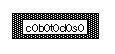
Partition Icon
Partitions appear as rectangular icons within physical disk icons. A partition icon is labeled with the name of the physical disk with which it is associated (disk access name). If a VM disk exists for a partition (and its corresponding VM disk icon appears in a disk group view), the partition icon is shaded. A partition usually represents slice 0 of the disk (all application-accessible space on the disk). Partition icons appear in the View of Disks.
Figure 28 Partition Icon
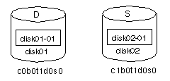
VM Disk Icon
VM disks appear as cylindrical icons labeled D. They usually contain subdisks, which are represented as rectangles. A VM disk is one that is both under Volume Manager control and assigned to a disk group. VM disk icons represent the disk media records used to map the logical aspect of VM disks to physical disks. A VM disk icon is labeled with its disk media name. The name of the partition with which the VM disk is associated appears below the VM disk icon. VM disk icons typically appear in a disk group view. If a VM disk is designated as a hot-relocation spare, its icon label changes from D to S.
Figure 29 VM Disk Icons
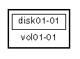
Subdisk Icon
Subdisks appear within VM disks as rectangular shaped icons. Subdisk icons are also duplicated within any plex icons with which they are associated. In plex and VM disk icons, subdisk icons that represent non-contiguous storage are visually separated by small gaps. Subdisk icons typically appear in disk group views and in the View of Volumes.
Figure 30 Subdisk Icon

Log subdisks (used to log disk activity for Dirty Region Logging or RAID-5 logs) have icons with double borders to distinguish them from regular subdisk icons.
Figure 31 Log Subdisk Icon

Plex Icon
Plexes appear either alone or within volumes as relatively large rectangles containing subdisks. Plex icons have a heavy border to distinguish them from partition or subdisk icons. Plex icons typically appear in disk group views and in the View of Volumes.
Figure 32 Plex Icon
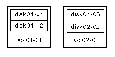
Striped and concatenated plexes differ visually in that a striped plex has gaps between its subdisks, while the subdisks of a concatenated plex are joined. Figure 33 illustrates the difference between concatenated (vol01-01) and striped (vol02-01) plexes.
Figure 33 Concatenated and Striped Plex Icons
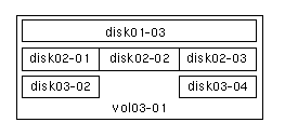
In its simplest form, a striped plex has one subdisk per stripe column. However, multiple subdisks can exist per stripe column.
Figure 34 illustrates a striped plex with one subdisk in the top stripe column and multiple subdisks in the middle and bottom columns. The bottom column contains a gap where a subdisk has been removed; this gap can be filled with one or more subdisks.
Figure 34 Striped Plex with Multiple Subdisks per Column
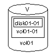
Volume Icon
Volumes appear as cylindrical icons labeled V. These icons often contain plex and subdisk icons. Volume icons are distinguished from disk icons by a heavy border. Volume icons typically appear in disk group views and in the View of Volumes.
Figure 35 Volume Icon
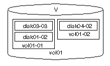
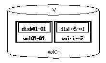
Mirrored volumes contain two or more plex icons. The following is a mirrored volume with one striped plex (vol01-01) and one concatenated plex
(vol01-02).
Figure 36 Mirrored Volume Icon
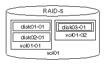
A RAID-5 volume contains a single RAID-5 plex icon and may contain one or more log plex icons. The following is a RAID-5 volume with one RAID-5 plex (vol01-01) and one log plex (vol01-02). RAID-5 volumes are labeled
RAID-5 instead of V.
Figure 37 RAID-5 Volume Icon
Busy Icons
With some operations, icons are updated almost instantly to reflect the results of the operation just performed. During other operations, it may take awhile for a particular icon to update itself. While being updated, icons are prevented from accepting input or undergoing configuration changes. The Visual Administrator greys out the text in that icon so that you are aware that it is temporarily unavailable for further configuration operations. No input is accepted by an icon while it is greyed out. As soon as the icon is fully updated, it returns to its normal visual state and accepts input again. Icons that are temporarily greyed out in this manner are also referred to as blocked icons.
Figure 38 illustrates a plex icon that is temporarily greyed out.
Figure 38 Busy Icon
Using the Mouse With the Visual Administrator
A two-button or three-button mouse is required in order to use the Visual Administrator. The Visual Administrator enables you to use the mouse (either alone or together with certain keyboard keys) to select, manipulate, or display the properties of icons and their underlying objects.
Table 1 describes terms associated with the use of the mouse.
Table 1
Terms Associated with Use of Mouse
Term | Definition |
| Click | Press and release the mouse button in a single, smooth motion. |
| Double-click | Click the mouse button twice in rapid succession. |
| Press and Hold | Press and continue to hold down the mouse button. |
| Point | Move the tip of the pointer onto an item on the screen. |
| Drag and Drop | Press and continue to hold down the mouse button while moving the mouse and pointer (to drag an object). Release the button when the pointer reaches its destination (to drop the object). |
| Select | Click the mouse button while the pointer is directly over the item to be selected (such as an icon). |
Throughout this guide, the mouse buttons are referred to as the LEFT, MIDDLE, and RIGHT buttons. Table 2 describes the default mouse buttons and their locations, which vary according to the number of buttons on the mouse.
Table 2
Default Mouse Buttons
Virtual Mouse Button | 3-Button Access | 2-Button Access |
| LEFT | LEFT | LEFT |
| MIDDLE | MIDDLE | Ctrl-LEFT |
| RIGHT | RIGHT | RIGHT |
| Shift-LEFT | Shift-LEFT | Shift-LEFT |
| Shift-MIDDLE | Shift-MIDDLE | Ctrl-RIGHT |
| Shift-RIGHT | Shift-RIGHT | Shift-RIGHT |
Note: This guide assumes you are using a 3-button, right-handed mouse. Button 1 is the LEFT button and Button 3 is the RIGHT button. It is possible to remap mouse buttons (using the xmodmap command, for instance). Refer to your X Window System documentation for details.
Table 3 lists the mouse and keyboard combinations recognized by the Visual Administrator.
Table 3
Mouse and Keyboard Combinations
Action | Result |
| LEFT | Selects a single icon. Clicking LEFT on an icon causes that icon to be the currently-selected one; any previously-selected icons are de-selected. |
| Shift-LEFT | Toggles between minimizing or maximizing an icon. A maximized icon displays all of its components in detail. A minimized icon is compressed and its components are concealed. |
| MIDDLE | Selects either one icon or multiple icons simultaneously. When selecting with the MIDDLE button, any previously-selected icons remain selected along with the newly-selected one. Clicking MIDDLE on a selected icon de-selects that icon. |
| Shift-MIDDLE | Toggles between starting or stopping projection on the selected icon. |
| RIGHT | On an icon that is not undergoing analysis, displays the properties form for that object. On an icon that is undergoing analysis, displays the analysis statistics form for that object. |
| Shift-RIGHT | Always displays the properties form for the object, regardless of whether analysis is in effect. |
Views
Views are special Visual Administrator windows that display icons representing all or a subset of the objects currently known to the Visual Administrator. With views, you can examine and manipulate different parts of the physical and logical storage systems. Icons can be added to or removed from views only with the Visual Administrator.
From a view window, you can do any of the following:
- Close the window or exit the Visual Administrator completely through the File menu.
- Perform file system, volume, and disk operations through the Basic-Ops menu.
- Perform volume, plex, subdisk, disk group, and disk operations through the Advanced-Ops menu.
- Display visual or numerical statistics for a Volume Manager object's performance through the Analyze menu.
- Display visual information about the properties and associations between icons through the Projection menu.
- Set user preferences through the Options menu.
- Perform assorted operations on icons through the Icon menu.
- Open a help facility window through the Help menu.
Each view window title includes the name of the machine on which the Visual Administrator session is running. If the Visual Administrator is running in demo mode, the string (DEMO) appears in the view window title instead.
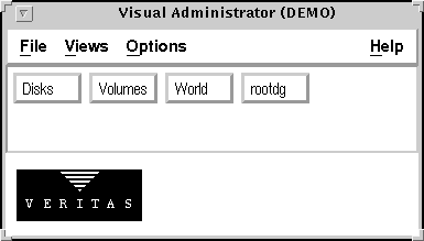
Once the Visual Administrator is started, the Visual Administrator main window appears. This window provides a view button area (the views subwindow) containing a button for every view on the system. Views are accessed by clicking the LEFT mouse button on the appropriate view button in the views subwindow.
Each disk group (a collection of disks that share a common configuration) is represented by the Visual Administrator as a view window instead of an icon. The VM disks, volumes, and other objects belonging to a particular disk group are all displayed within that disk group's view.
Figure 39 illustrates the Visual Administrator main window.
Figure 39 Visual Administrator Main Window
Types of Views
There are two types of views in the Visual Administrator: default and user-created views. Both view types function identically, but certain restrictions are placed on default views. Default views cannot be removed or renamed by users, unlike user-created views.
Default Views
The default views provided by the Visual Administrator include:
- View of
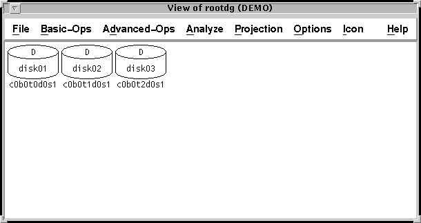
rootdg -- Displays all objects that have been assigned to the default disk group, rootdg (including Volume Manager disks, volumes, and associated objects). If additional disk groups are created, the Visual Administrator creates views for them. Disk group views can be used for most operations.
- View of Disks -- Displays all physical disks on the system.
The View of Disks displays icons for each physical disk. Each disk that has been initialized for Volume Manager use has a device entry on the system. This view is an iconic representation of the physical storage subsystem. This view is used for disk and disk group operations only.
- View of Volumes -- Displays all volumes (as well as plexes and associated subdisks) on the system. The View of Volumes displays all Volume Manager volumes, regardless of disk group. Plexes and any associated subdisks are also displayed here. Although this view can be used for various operations, it is preferable to use a disk group view for volume operations.
- View of World -- Displays all objects on the system (including physical disks, volumes, and associated objects). The View of World displays all Volume Manager disks, volumes, and plexes, regardless of disk group. This view essentially combines both the Disks and Volumes views. It also contains any unassociated plexes, which do not appear in most other views. Although this view can be used for various operations, it is generally preferable to use a disk group view or the Disks view for disk operations.
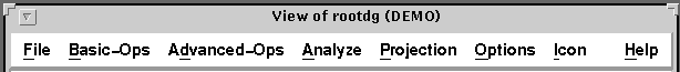
Figure 40 illustrates a View of rootdg window that does not yet contain any volumes.
Figure 40 View of rootdg
User-created Views
A user-created view is a view window that focuses on a particular part of a physical and/or logical storage system, as defined by the system administrator. The system administrator can create views consisting of a selected collection of icons. For example, you can create a special view to correspond to a physical or logical grouping (such as a view for the accounting department). User-created views enable you to isolate part of the storage subsystem in order to observe or monitor that part of the configuration.
User-created views differ from default views in that they contain copies of icons from default views. Operations performed on these icon copies are reflected in the default views that display the affected icon(s).
User-created views can be created using the Views pull-down menu from the Visual Administrator main window. Once created, icons can be added to a new view window by copying them over from existing views via the Icon menu, or by dragging them into the desired view.
For detailed information on creating, renaming, or removing views,
refer to Table 7, Table
8, and the section"Remove View Form."
Menus
The Visual Administrator provides hierarchical menus called pull-down menus, which provide access to various Visual Administrator features, operations, forms, and user preference settings. Some of these menus are cascading menus, which contain sub-menus of their own. The Visual Administrator windows allow you to select operations or access forms. Help is available on every menu to assist you in understanding the current operation and navigating through the Visual Administrator. Menu access varies according to the type and location of the menu.
Each Visual Administrator window contains a title bar that identifies the window and the machine on which the Visual Administrator session is running. Below the title bar is a menu bar that provides access to the menus available with that window.
Pull-down menus on the menu bar can be accessed using either the mouse or the keyboard, as follows:
- Mouse -- Place the pointer on the appropriate menu name in the menu bar and then click the LEFT mouse button.
- Keyboard -- Press Alt-key or Meta-key, where key is the mnemonic (underlined character) associated with the menu name.
Figure 41 illustrates both the title bar and menu bar of a typical view window.
Figure 41 Title and Menu Bars
Once you access a pull-down menu, you may select any available option in that menu. Unavailable options are displayed in greyed-out text. Some menu selections lead to cascading sub-menus; some lead to forms that can be completed and then applied; some simply execute a specific operation immediately.
The menus available in the menu bar vary according to the type of window being displayed. The following menus are, however, common to most Visual Administrator windows:
- File -- Typically gives you the option of closing the window or exiting the Visual Administrator completely.
- Options -- Provides various options that allow you to specify preferences for how the Visual Administrator should operate.
- Help -- Provides information relating to the current window, its menus, and related topics.
Forms
The Visual Administrator uses forms to provide useful information about existing objects and configurations. You can use these forms to examine or change existing information. Forms generally contain one or more fields that may accept or require your input. Forms contain buttons that can be used to carry out certain actions relating to the form. Error messages appear directly in forms when there is a problem with the form or its input.
There are two basic types of forms:
- General forms tend to appear during operations or setup requests and usually accept or require your input. General forms are usually accessed via certain menu selections.
- Properties forms display detailed information about a specific object's current characteristics, some of which can be modified directly through the properties form. Properties forms are accessed by placing the pointer on the chosen icon and then clicking the RIGHT button (unless the icon is undergoing analysis, in which case Shift - RIGHT must be used instead).
Fields
Some form fields require input to proceed with an operation. If a required field is either blank or incorrect, an error message will result. Other form fields already contain information (such as default values) that you can either alter or accept. Yet other form fields are read-only and therefore cannot be changed; these fields beep when you try to change them.
Form fields can be altered or completed in various ways, depending on the type of field. Some require text to be typed in; others make use of assorted buttons that can be toggled or selected.
Any form fields that are not currently applicable or available are greyed out.
Buttons
All forms have buttons at the bottom that perform these standard functions:
- Apply -- Accept the information on this form, check for errors, and continue with an operation. Pressing the Return key is the equivalent of selecting Apply with a form. For a properties form, the Visual Administrator issues the appropriate commands to make the changes.
- Reset -- Fill in the fields of the form with its default values. If the form is a properties form, the Visual Administrator uses the values that were present when the form first popped up.
- Cancel -- Ignore all changes made on the form and close it. If the form was brought up as part of an operation, that operation is also canceled.
- Help -- Pop up the Help window with information about this form.
Some forms are read-only; only the Help and Cancel buttons are provided on these forms.
Note: On some displays, certain forms may be too long to fit entirely on the screen and the buttons and fields at the bottom of the form may not be visible. If this is the case, use the window manager's move window function (Alt-F7 by default) to move the form so that you can see the desired buttons or fields.
Error Messages
Error messages typically occur when Apply is selected with one or more fields incorrect on the form. If this happens, a message appears at the bottom of the form, and you can correct the values for those field(s). If the error cannot be corrected or the operation is no longer desired, select Cancel.
Warning Boxes
The Visual Administrator uses dialog boxes to present some error and warning messages. When a message is displayed in this manner, you must acknowledge it by selecting one of the buttons displayed in the error dialog box before proceeding. Some warning boxes announce that a prerequisite has not been met, so you must click the displayed Continue button before you try the operation once again (see Figure 42).
Figure 42 Warning Box
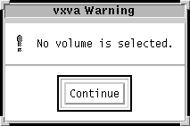
Note: If you use a virtual window manager, and you place any Visual Administrator window in a window other than the one containing the Visual Administrator main window, your Visual Administrator session may freeze for no apparent reason. Your session may be frozen because a warning box in another virtual window requires you to click on the continue button. Until you dismiss the warning box, your Visual Administrator session will remain frozen. It is therefore recommended that you keep all Visual Administrator windows associated with your current session on the same virtual screen. If you have closed the main window to an icon, you will run into the same problem.
Help
The Visual Administrator provides an extensive help facility to assist you in navigating through Visual Administrator. Help windows are included throughout the various Visual Administrator windows, menus, and forms to provide relevant information. Help information varies according to the location and circumstances.
Using Help
Depending on the location, Help windows are accessed by:
- clicking the LEFT mouse button on the Help menu in a window's menu bar
- clicking the LEFT mouse button on the Help option in a menu
- clicking the LEFT mouse button on the Help button at the bottom of a form
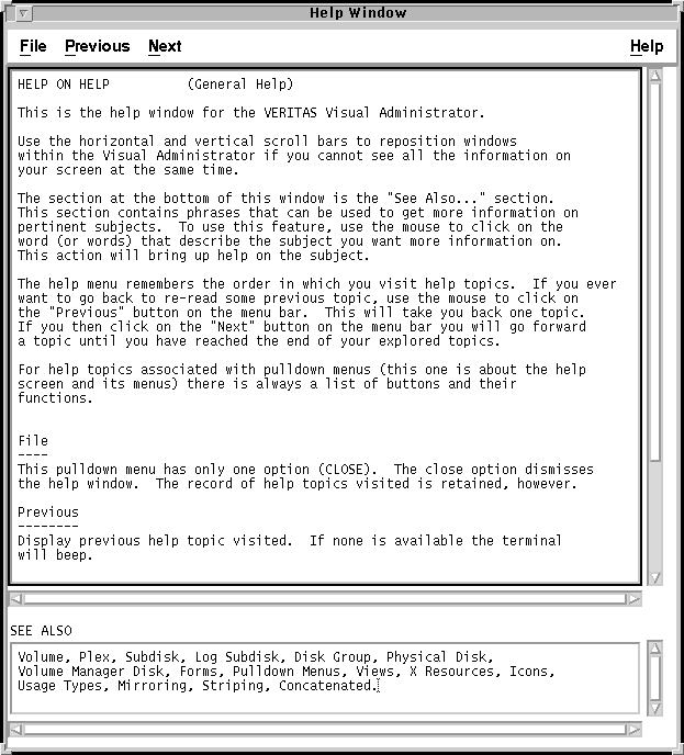
Once Help is invoked, a Help window containing information relevant to the current window, menu, form, or operation appears. The Help window is equipped with both horizontal and vertical scrollbars, which allow you to scroll through the available Help text.
At the bottom of each Help window is a SEE ALSO area. This area lists similar or related Help topics and operates like hypertext documentation links. To access any of the listed Help topics, simply click the LEFT button on the appropriate word(s) in the SEE ALSO list; a new Help screen containing information on the selected topic replaces the previous help text.
The Help facility keeps track of the order in which Help topics are visited. You can therefore return to a previous topic. Selecting Previous from the menu bar displays the preceding topic. Selecting Next displays the succeeding topic.
The Help menu in the menu bar of the Help window itself provides access to the following:
- General Help -- Accesses Help text that includes general information on the Visual Administrator Help facility and how it is used.
- Help Index -- Accesses a complete listing of the available Help topics, arranged in logical groupings. Once a topic is identified from this list, that topic can be directly accessed from the SEE ALSO section of this Help window, which lists all topics alphabetically. Clicking LEFT directly over the topic name in the SEE ALSO section causes that topic to appear in the Help window.
Figure 43 shows a typical Help window. To close the Help window, select the Close option from the File menu. Though the Help session is closed, the system will retain a record of help topics visited.
Figure 43 Help Window
Color and Bitmap Patterns
Depending on the type of monitor being used, Visual Administrator employs color or bitmap patterns to indicate:
- the state of an icon
- the activity level of an icon
- relationships between icons
- failure of an operation
If a color monitor is used, the default colors are red, yellow, grey and green. If a monochrome monitor is used, bitmap patterns of varying textures and shades are used instead of colors. By default, standard X Window System bitmaps (typically located in /usr/include/X11/bitmaps) are used to create these patterns.
Table 4 gives the values for the default colors and bitmap patterns associated with Visual Administrator icons under different conditions.
Table 4
Default Colors and Patterns
Situation | Color | Bitmap Pattern |
| selected icon | green | grey3 |
| disabled icon | grey | stripe4 |
| alarmed icon | red | grey1 |
| free subdisk icon | yellow | root_weave |
| projection | yellow | root_weave |
| analysis: low | green | cross_weave |
| analysis: medium | yellow | root_weave |
| analysis: high | red | wide_weave |
Note: This guide assumes that the default colors or bitmaps are being used. However, colors or bitmaps (as well as other interface preferences) can be redefined in your .Xdefaults file. Refer to Appendix A for information on resetting these defaults.
It is possible for a single icon to be in multiple states represented by different colors or patterns at once. For example, a given icon may be both selected and under projection at the same time. In such cases, the Visual Administrator reflects the color or pattern that represents the highest priority. The following is the priority list for possible icon states, starting with the highest priority:
- 1. blocked
- 2. error
- 3. selected
- 4. projected
- 5. analyzed
- 6. enabled
An icon that is in the blocked state (highest priority) is one that is currently busy and cannot allow any mouse or keyboard input. The text within a blocked icon is greyed out to indicate that it is inaccessible.
Styles of Operation
Operations can be performed in the following ways with the Visual Administrator:
- Select-Operate -- An icon representing a Volume Manager object is selected, and then the desired operation is performed on that object via menus and/or forms.
- Drag and Drop -- An object is manipulated by dragging its icon and then dropping it elsewhere (such as on another object in a view window).
Select-Operate
The select-operate interface works as follows:
- 1. Select an icon representing a Volume Manager object by positioning the pointer over the icon and clicking the LEFT button (when selecting a single icon) or MIDDLE button (when selecting multiple icons).
- 2. From the Visual Administrator pull-down menus, choose and activate the operation to be performed on the selected icon(s).
Some operations require that a form be completed before the operation
is activated.
Drag and Drop
The drag and drop interface works as follows:
- 1. Drag an icon by placing the pointer on it, pressing and continuing to hold down the LEFT mouse button, and moving the mouse until the outline of the icon is superimposed on its destination.
- 2. Drop an icon by releasing the LEFT mouse button when the icon reaches its drop location.
Note: When dropping an icon onto another icon, the dragged icon must be positioned so that the pointer is directly over an unobscured portion of the icon on which it is to be dropped.
When an icon is dragged and dropped, the resulting operation depends on the icon type and drop location (see Table 5).
Table 5
Drag and Drop Operations
Icon Type | Drop Location | Action |
| free subdisk | view window | Creates a plex and associates the subdisk to the plex. |
| free subdisk | VM disk | Creates an identically-sized subdisk on the disk. |
| free subdisk | plex | Associates the subdisk to the plex. |
| associated subdisk | free subdisk | Swaps the associated subdisk with the free subdisk. Data on the original associated subdisk is synchronized onto the free subdisk. The free subdisk becomes associated and replaces the original subdisk. |
| associated subdisk | VM disk | Creates an identically-sized free subdisk on the VM disk, then swaps the associated subdisk with the new free subdisk. Data on the original associated subdisk is synchronized onto the free subdisk. The free subdisk becomes associated and replaces the original subdisk, which is removed. |
| associated subdisk | view window | Dissociates the subdisk from the plex. |
| dissociated subdisk | striped plex column gap | Associates the subdisk with the plex. |
| dissociated plex | user-created view window | Copies the plex icon to the user-created view. |
| plex | volume | Associates the plex to the volume. |
| disk | user-created view window | Copies the physical or VM disk icon to the user-created view. |
| volume | user-created view window | Copies the volume icon to the user-created view. |
| partition | disk group view | Adds a VM disk (corresponding to the partition) to the disk group. |
Note: Not all operations are allowed by the Volume Manager at all times. For example, you cannot dissociate the last plex of a started volume.
Basic Versus Advanced Operations
The Visual Administrator can be used to perform several types of volume management and other administrative operations. Most of these operations can be invoked from the Basic-Ops and Advanced-Ops menus in the menu bars of the views windows.
The basic and advanced operations menus provide two distinct approaches to volume management:
- Basic -- The basic approach typically uses the Volume Manager's
vxassist utility, which takes information about what you want to accomplish and automatically performs the necessary underlying tasks. This approach requires only minimal input, but does permit more detailed specifications. Basic operations are accessed via the Basic-Ops menu.
- Advanced -- The advanced approach typically uses the Volume Manager command set, which consists of a number of fairly complicated commands that often require you to specify detailed input. The Volume Manager commands use a "building block" approach that requires you to have a detailed knowledge of the underlying Volume Manager structure and components to manually perform the sequences of commands necessary to accomplish a certain task. Advanced operations are accessed via the Advanced-Ops menu.
Some operations are available through one approach only, while others can be handled through either the Basic-Ops or Advanced-Ops menu.
Note: When creating and manipulating volumes, first select which approach to use and then proceed with that approach only. The basic and advanced approaches cannot be combined to perform a single volume operation. Use the basic approach whenever possible.
Quick Reference to Views Menus and Forms
The Visual Administrator main window contains a Views menu, which is used to create and modify view windows.
Views Menus
The following options are accessed via the Views menu (located in the Visual Administrator main window only).
Table 6
Views Menus
Menu /Submenu Access | Description |
| Views > Create a View | Creates a new user-specified view (also known as a user-created view or user view). Specify a unique name for this new view. Once created, icons can be added to this new view window by copying them over from existing views.
User-created views differ from default views (disk, volume, disk group, and world views) in that they contain copies of icons from the default views. See Also: * Create View Form (Table 7) |
| Views > Rename a View | Renames an existing user-created view. Specify a new, unique name for the view. Requirements: * Only a user-created view can be renamed. * The new view name must be unique. See Also: * Rename View Form (Table 8) |
| Views > Remove Views | Permanently removes a
user-created view. The removal of a user-created view results in the
removal of its icons, but the objects represented by those icons are
unaffected. Requirements: * Only a user-created view can be
removed. See Also: * "Remove View Form" |
Views Forms
The following forms are accessed via the Views menu (located in the Visual Administrator main window only).
Create View Form
This form is used to create a new view window. Once created, this view is represented by a new view button in the Visual Administrator main window. This user-created view is also retained across future Visual Administrator sessions.
Table 7
Create View Form
Field | Description |
| View Name: | Determines the name of the view to be created. This name must be unique. The maximum length of the name is 31 characters. This field is required. You can delete or rename this view at a later time. |
Rename View Form
This form is used to change the name of an existing user-created view.
Table 8
Rename View Form
Field | Description |
| Old View Name: | Lists the name of the view to be renamed. This name must belong to a user-created view. This field is required. |
| New View Name: | Lists the name to which the existing name is to be changed. This name must be unique. The maximum length of the name is 31 characters. This field is required. |
Remove View Form
This form is used to remove a user-created view. This form contains no fields. Instead, it lists all user-created views that currently exist.
Select one or more views for removal by highlighting the desired view name(s) with the LEFT button. If a view is mistakenly selected, the LEFT button can be used again to clear that view name. Removal is activated by clicking LEFT on the Apply button once, then confirming the removal by selecting Apply again (this ensures that a view is not accidentally removed).
[Next] [Previous] [Top] [Contents] [Index]